This is my blog for my AS Media Studies Coursework. I hope you enjoy every step of my journey through the making of my music magazine.
Friday, 11 December 2015
Textual analysis of double page spreads
A double page spread usually consists of an article about someone and it could even include an interview. Below I have analysed 3 double page spreads that star Nicki Minaj, Amy Winehouse and Lady GaGa.
Click download above to see the full presentation.
Textual analysis of contents pages
A contents page normally comes after the front cover and it hold all the information about the magazine such as, the new features, the articles and the numbers of the pages where everything is. Below I have analysed 3 magazine contents pages, including Vibe and Billboard.
Please click the below thumbnails if the embedded work above is not viewable.
Please click the below thumbnails if the embedded work above is not viewable.
Thursday, 19 November 2015
Cover image and camera shots
The main cover image plays an important role as it represents the ideal leader. It is the first thing a reader would see on the cover, so it needs to stand out from a whole range of magazines in the shop to grab the audiences attention. Therefore, it is important that the camera shots used are correct.
Extreme close up

Extreme close up

Extreme long shot
Close up
Long shot
Medium close up
Medium long shot
Medium shot
The majority of magazines use the two same specific shots for their front cover image. Either a medium shot or a close up. Usually the artist on the front cover is selling the magazine or the magazine is selling the artist, so these shots need to be clear. For my front cover image I will most likely be using a close up shot.
Other shots such as, long shots, will most likely be used on a geographical magazine where there is no need for a model.
Wednesday, 18 November 2015
Representation of colours
Having the correct colours on a magazine is vital. Different colours will appeal to different people and therefore, you have to know what colours are suited to your target audience. Different colours also represent different things. For example, if you had an image that incorporated water, the colours you would associate with that in your cover lines would be blue. Lastly, you have to know what colours work well together and which ones compliment each other well so that you have an appealing looking magazine.

The colour blue represents:
- cold
- winter
- sad
- boys
- masculinity
- sky
- sea
- water
- weather
The colour grey represents:
- simplicity
- plain
- unhappy
- boring
- dull
- dark
- sad
- clean
- classy
- winter
- futuristic
The colour red represents:
- seriousness
- anger
- fire
- burning
- romance
- passion
- danger
- love
The colour yellow represents:
- caring
- money
- summer
- brightness
- warmth
- sun
- happiness
- hot
The colour green represents:
- earth
- environment
- nature
- sport
- caring
- helpfulness
- grass, trees, forest, leaves
The colour pink represents:
- girls
- femininity
- cute
- love
- romance
- fun
- beauty
- artistic
Considering my magazine target audience is women, particularly young adults, I will be using the colours pink, black, grey, red, white and blue. The background will be dark colours, possibly black, and then the cover lines will be white, red, pink and blue. I feel that these colours will stand out better on a darker background.
Textual analysis of front covers
Textual analysis is the deconstruction of existing media texts and here I have deconstructed 4 existing music magazines and analysed their front covers.
Textual Analysis
Textual Analysis
Thursday, 12 November 2015
Analysing magazine front covers
Below I have analysed the key features on a magazine front cover and why they're important in order to make an appealing and successful magazine.
Purpose of a front cover
The front cover functions to entice readers to buy the magazine. They may not pick up the magazine in the first place to read what is inside unless the font cover attracted them. The front cover is made up of a number of important features, which are common conventions of magazines.
Masthead
It is the name of the magazine and is always displayed at the top. The font and the colour scheme will have been chosen very carefully to help sell the magazine and give the audience an indication of it's style and content.
Tagline
The tagline goes near the masthead and it shows what the magazine is about or who it may be aimed at.
Central image
This is one of the most important parts of of the front cover as it is what catchers the readers eye before they even look at the text. The central image will be relevant to the magazines purpose and audience and will be usually be related to the lead article.
Cover model
A cover model will usually be a celebrity or a well known individual connected with the magazines genre. The miss-en-scene of the model, such as their clothes or pose will reflect the style of magazine and who buys the magazine.
Anchorage
This is a term that refers to how images are referred to. In magazines images will be anchored by captions, cover lines, articles or headlines. Anchoring an image helps give it a meaning and helps the reader understand the significance.
Secondary images
They may be used on the front cover to help promote other features in the magazine, usually anchored by a cover line. They are usually used to entice the reader by a picture rather than the cover line text.
Cover lines
Cover lines are usually located at various points on the magazine front cover telling readers about the magazines contents and specifically the articles they will find.
A puff
A puff is a device which helps draws attention to and promote certain elements in the magazine. They are often set against a colourful background and presented in a rounded shape. Quite often they represent a "freebie" or special offer inside the magazine.
A pug
A pug is called the 'ears of a magazine', usually placed at the top left or right hand corners on the front cover and normally display a promotion from the magazines edition or the price.
Barcode, Price, Edition
These are straightforward features but need to be strategically placed. The barcode shouldn't distract or interfere with any other features on the magazine and the price will normally be placed near by. Most magazines are monthly editions so the month and the year will be displayed.
Colour
Some magazines will alter the colour schemes from edition to edition, however, others will get their colour scheme to coordinate with the central image. Sometimes the colour will be used to send off a particular message or the colour will help to promote a certain feature.
Font
Front covers will display a variety of different fonts, usually adapted to infer meaning to the text they're displaying. Font choices are manipulated for both mastheads and cover lines.
Serif - fonts with fancy feet.
Sans Serif - fonts without fancy feet.
Drop-cap - The first letter of the article tends to be in a larger, different or more elaborate font.
Below I have analysed the front cover of a Vogue magazine, featuring Jennifer Lopez as their cover star.
Analysis of vogue magazine front cover:
Language
Cover lines such as "your best body ever" refer to the reader and that this magazine with help them personally. This also grabs the readers attention.
Design
The masthead is placed at the top of the magazine cover in a large font. It's red font helps it stand out against the background. The image takes up most of the space on the cover, with cover lines on the sides. The image even overlaps the masthead, which shows us that it is a popular magazine. Different fonts are used and colours such as red, blue and white are used, which is suggested that the magazine is targeted for an older audience. They compliment each other and her red dress matches the masthead.
Image
Jennifer Lopez is featured as the main cover image for this particular magazine. She is a well known singer, actress, model, dancer, author, producer and fashion designer, which may influence people to buy the magazine. The magazine targets new readers as well as usual readers. The image is in direct mode of address, where the person in the image is looking straight at the reader. The direct gaze helps simulate interaction with each individual reader. The image of Jennifer Lopez is a medium shot and takes up most of the space on the front cover. Also around the image there is not much free space left.
Overall impression
In my opinion, I think that the front cover is effective, looks like a classy fashion magazine while targeting it's older female audience. It gives a good indication of what the magazine includes, which makes the reader look forward to reading the articles on how to better themselves and receiving tips from influential people who have a celebrity status.
My ideas
For my magazine I have a few brief ideas of what I would like, however, they still need a lot of developing. Anyhow, I thought that I would share my initial thoughts with you.
I know that I would like to 100% do a 'pop' music magazine. However, all the pop magazines that I have researched are aimed at young children such as, "top of the pops" and I would prefer mine to be aimed at teenagers and young adults. I would like it to include celebrity gossip, music, beauty and fashion. Therefore, my main inspirations are "Rolling stones" and "Billboard".
The initial picture in my mind of the front cover image was going to be a single person who would dominate the majority of the page. The colours in the outfits and accessories that they would be wearing, I would then match to the colour of the masthead, so that they would all compliment each other. The masthead would be big and bold and would be located at the top of the page.
I still have a long way to go, but I'm now starting to develop my thoughts and ideas.
Wednesday, 4 November 2015
Genre analysis
Genres
A genre is the type/style of something that is used to categorize media texts. Every genre has it's own style and set of conventions. The genre allows the audience to decide whether the film is for them.
A generic convention is something that tells the audience what the genre is.
A genre can then divided up into 3 main parts. There is major genres, sub genres and hybrid genres.
A major genre is the main and most common genre, a sub genre is a genre within a genre and a hybrid genre is a mix of genres.
Different genres and sub genres in music:
- classical
medieval, renaissance, choral
- dance
dubstep, garage, house
- electronic
electro, drum and bass
- hip-hop
old school rap, bounce, gangsta rap
old school rap, bounce, gangsta rap
- jazz
contemporary jazz, cool
- pop
teen pop, dance pop, electro pop, rock pop
- R&B/soul
disco, funk, soul
- reggae
dub, roots reggae
- rock
hard rock, metal, rock and roll
Hybrid genres
- country
- folk
- rock
- indie
- acoustic
- pop
- rap
Rock Sound is a rock magazine that generally focuses on pop punk, post-hardcore, metalcore, punk, emo, hardcore, heavy metal and extreme metal genres of rock music. Immediately the audience can tell the genre if rock because of the generic conventions that are portrayed. The 2 dominant colours are red and black and the fonts are big and bold. In this case the red symbolises blood, death and danger. The man on the cover image has tattoos, a necklace, an earring, a bracelet, a studded belt, a black glove, black clothes and a shaved head. He has a harsh, stern look on his face and is doing a punching symbol with his hand. The target audience for this is likely to be young male adults who are interested in rock music.
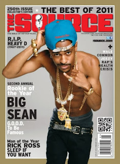 The Source is a hip-hop magazine. The Source is a United States based magazine covering hip-hop music, politics, and culture. The dominant colours here are red, black, grey and blue. The black and the grey are mostly used for the writings. The red is in the bold title and the blue is in his hat. The blue and red complement each other very well and the red stands out above the rest. 'Big Sean' is an American rapper, who is the cover image for this magazine. We can tell that this is a hip-hop magazine due to his gold necklaces, bracelets, earring, by not wearing a top, his big muscles, his body language, they way his trousers are partly pulled down, his hat is on backwards, the way he's posing with his hand and what is said in the writing. The target audience for this is most likely to be male teenagers - young adults. Not only would they need to be interested in music, but also politics and culture.
Rolling Stone Magazine is a magazine that focuses on popular culture. The magazine was first known for its musical coverage and for political reporting. In the 1990s, the magazine shifted focus to a younger readership interested in television shows, film actors, and popular music. In recent years, the magazine has resulted in a traditional mix of content. Rolling Stone is my inspiration for my music magazine. The target audience is teenagers and young adults.

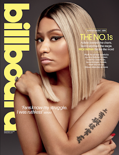
Billboard is another magazine that inspires me. Billboard is an American music magazine. The target audience for this would also be young adults.
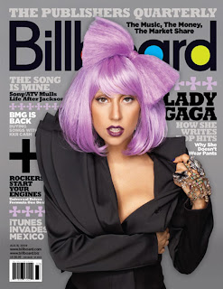
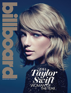
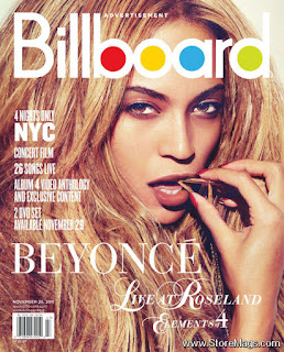
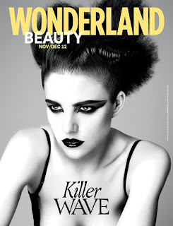
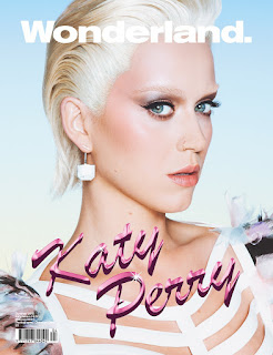
Wonderland magazine is a magazine that includes art, culture, celebrities, fashion and music. This magazine is crazy, fun and colourful. This is another magazine that I am influenced by.
Remix is not a music magazine, it is a fashion magazine, but I like their front covers.
Thursday, 22 October 2015
Evaluation of preliminary task
For my preliminary task, I decided to do print, which was a school magazine front cover.
I had to create a front page of a new school/college magazine, featuring a photograph relating to the school theme, plus some appropriately laid-out text and a masthead. I was very excited to start my preliminary task as I love photography and I am always reading and cutting up magazines, so this was right up my street!
The first thing we did was get all the camera equipment out, which included the camera, the lights, the backdrop and the tripod. We learnt how to use all of the equipment and the different techniques along with it, which included the different camera lenses, the aperture, lighting, rule of thirds and angles. The camera that I used was a Canon EOS 700D.
Then I had the tough decision of choosing a name for my magazine, however, after a long and hard think, I had my name, "Ed's Mag". My school is called St. Edmunds College, so this is where my inspiration came from. After finding my name, I drew out a sketch of what I wanted my cover to look including the words and phrases I wanted to appear.
I went onto a website called "Dafont.com", which is a website where you can find a variety of fonts. So after looking on here, I had chosen 6 of my top favourites.
Then I had to narrow it down to my favourite one, which was going to appear as my masthead on the front cover. This was a font called "Kingthings Organica".
During one of my Media Studies Coursework lessons, I went out with the camera to take my pictures. I took lots of pictures from a variety of angles and positions, so that when it came to choose my preferred picture, I had a good selection to choose from.
These were some of my experimental photos:


I then picked my favourite:
The next step was to upload this picture to "In Design", a programme used for desktop publishing. This was where I created my whole front cover. This was also the first time that I had used "In Design", so it took me a while to get to grips with it. I am such a perfectionist, so for me the picture had to be perfect. Also, from personnel experience, when I buy magazines, the picture is what grabs my attention, so I wanted mine to look just as appealing. I then played around with my masthead and it's size, colour and position, created a colour scheme, added drop shadows, emboss effects, lighting, fonts and sizes and additional images. My colour scheme consisted of different shades of blue and a few other additional colours, which were all able to compliment each other well. I then added my captions using different fonts in a variety of sizes and colours.
This was the final result of my magazine:
The most important thing I learnt from this preliminary task was that the photography had to be spot on, especially with the use of the different camera shots. The biggest challenge I faced in my preliminary task was being patient with the camera when taking the pictures, and also understanding softwares such as "In Design". I know that in my main production, I will be learning about many more softwares such as Photoshop, so I know I am going to have to be patient when it comes to this. The skills learnt here in my preliminary task are the skills that I will continue to develop and learn about so that when it comes to my final production I will know exactly what to do and how to use them much more effectively.
I had to create a front page of a new school/college magazine, featuring a photograph relating to the school theme, plus some appropriately laid-out text and a masthead. I was very excited to start my preliminary task as I love photography and I am always reading and cutting up magazines, so this was right up my street!
The first thing we did was get all the camera equipment out, which included the camera, the lights, the backdrop and the tripod. We learnt how to use all of the equipment and the different techniques along with it, which included the different camera lenses, the aperture, lighting, rule of thirds and angles. The camera that I used was a Canon EOS 700D.
Then I had the tough decision of choosing a name for my magazine, however, after a long and hard think, I had my name, "Ed's Mag". My school is called St. Edmunds College, so this is where my inspiration came from. After finding my name, I drew out a sketch of what I wanted my cover to look including the words and phrases I wanted to appear.
I went onto a website called "Dafont.com", which is a website where you can find a variety of fonts. So after looking on here, I had chosen 6 of my top favourites.
Then I had to narrow it down to my favourite one, which was going to appear as my masthead on the front cover. This was a font called "Kingthings Organica".
During one of my Media Studies Coursework lessons, I went out with the camera to take my pictures. I took lots of pictures from a variety of angles and positions, so that when it came to choose my preferred picture, I had a good selection to choose from.
These were some of my experimental photos:


I then picked my favourite:
The next step was to upload this picture to "In Design", a programme used for desktop publishing. This was where I created my whole front cover. This was also the first time that I had used "In Design", so it took me a while to get to grips with it. I am such a perfectionist, so for me the picture had to be perfect. Also, from personnel experience, when I buy magazines, the picture is what grabs my attention, so I wanted mine to look just as appealing. I then played around with my masthead and it's size, colour and position, created a colour scheme, added drop shadows, emboss effects, lighting, fonts and sizes and additional images. My colour scheme consisted of different shades of blue and a few other additional colours, which were all able to compliment each other well. I then added my captions using different fonts in a variety of sizes and colours.
This is indesign:
After perfecting it about 100 times, I was happy to say that I was finished and pleased with my end result.
This was the final result of my magazine:
The most important thing I learnt from this preliminary task was that the photography had to be spot on, especially with the use of the different camera shots. The biggest challenge I faced in my preliminary task was being patient with the camera when taking the pictures, and also understanding softwares such as "In Design". I know that in my main production, I will be learning about many more softwares such as Photoshop, so I know I am going to have to be patient when it comes to this. The skills learnt here in my preliminary task are the skills that I will continue to develop and learn about so that when it comes to my final production I will know exactly what to do and how to use them much more effectively.
Thursday, 17 September 2015
Important definitions
Below are some definitions that I have recently picked up on and I think that will be important to me when constructing my magazine.
Media language is when the media text communicates to the audience and how the media texts are constructed.
Media language is when the media text communicates to the audience and how the media texts are constructed.
Representation is the construction of reality in media text.
Audience – consumers of media text.
Mise-en-scene – everything else in the frame e.g. clothes, props, lights.
Wednesday, 16 September 2015
First post
Hey, I'm Niamh!
This is my first blog post where I will be introducing my AS Media Studies Coursework.
It will include a preliminary task, the research and planning, the production of my final product and the evaluation. I have chosen for my final task to do print, which will be a music magazine, which will consist of a front cover, contents page and a double page spread.
I hope you enjoy the journey through my coursework.
Take care,
Take care,
Niamh.
Subscribe to:
Comments (Atom)


