Friday, 26 February 2016

Magazine design - masthead

So, after choosing my cover image, I had to design my masthead. I originally chose 3 fonts on Photoshop, before I found the perfect font on a website called 'Dafont.com'. The first 3 that I chose on Photoshop were 3 separate fonts and I used 3 different shades of pink. I then played around with the sizes, drop shadows, bevel and emboss, contour, texture, stroke and inner shadow.

Below are the 3 different fonts that I originally designed and a screenshot of them being edited on Photoshop.


I then had to do all of this again after I found my preferred font on 'Dafont.com".


After editing it, I then had to choose which colour I preferred. I ideally wanted the colour of the masthead to match a colour on the image. I originally wanted the picture to be in black and white and the masthead to be bright pink, however, I changed my mind in that I want the picture to be in colour, so I then had to create mastheads to match. I first chose a pale pink/beige colour to match her lips, however, I thought it was too neutral and didn't stand out enough. Then I chose a blue/green colour to match her eyes, however, I thought that it wasn't a very female colour, considering they're my target audience. So I thought I would go for a more suited colour for my audience and I chose pink, but it didn't really match anything on the picture. In the end, I chose a red/orange/pink colour that matches the headphones cable really well, it stands out and is attractive to my target audience.

Here are all the colours I experimented with:


End result 


Thursday, 25 February 2016

Magazine design - cover image

So guys, it has come to the time for me to start designing my magazine!!! 

After a very long time of thinking and narrowing down pictures, I have found the image that is perfect for the front cover! When choosing the cover image, I had to bear in mind the generic conventions of a music magazine. Therefore, I knew that in my image, there had to be a set of headphones. I also knew that I wanted her to be looking directly into the camera, so that it would help grab the readers attention even more. Lastly, I knew for certain that I wanted the cover image to be a close up. Therefore, this helped me narrow down my choices even more.  I originally chose one picture that I absolutely loved, so I uploaded it to Adobe Photoshop, however, when it came to fitting it to the dimensions, it didn't work. So, I had to keep trying with different pictures until I found one that looked and fitted perfectly. 


This was the very first picture I chose, however, the dimensions didn't work.


Then I chose this one, however, when it came to fitting the masthead, it clashed with the "B" sign on the hat.


Then I chose this one, however, I wanted more of a close up.


So, finally, I chose this one because she was wearing headphone, looking directly into the camera, it was a close up and there was room for the masthead. 


However, this picture was quite dark, so I had to play around with the levels of brightness on Photoshop, until I reached one that I was satisfied with. 


Below you can see the image that I made brighter and used as my final cover image.


Tuesday, 23 February 2016

Contact Sheet

I created something called a 'contact sheet', which is a few pieces of paper with all my photographs printed on them. This allowed me to go through all of the pictures and tick my favourite ones, which helped me to narrow down all the photos.

Below you can see 5 sheets of paper with my pictures on. The ones with crosses next to them are my favourites and are the ones that I can visualise being in my magazine.


Monday, 22 February 2016

Magazine inspiration

Below is a collage that I made of all of the magazines that inspire/inspired me for my magazine. This includes music magazines such as, The Rolling Stones, Billboard, Wonderland, Remix, Q, Vibe and Clash.

Friday, 12 February 2016

Taking the pictures

Below are the pictures that my friend Jess took of me taking pictures of Caitlin, to prove that it was actually me taking the pictures.


Me cooperating with the model 


Here you can see the use of the fan


This is one of my favourite pictures that Jess took because in the frame you can see me taking Caitlin's picture as well as my laptop with the post about poses so that I can refer to them.


Tuesday, 9 February 2016

Pictures of the shoot

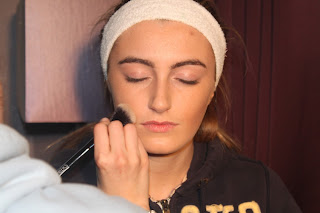
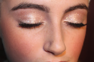
So whilst doing Caitlin's make-up, my friend Jess took pictures of me doing the make-up, she took pictures of the make-up itself, pictures of the equipment set up in the room and pictures of me doing the shoot. The reason behind this was so that I could have evidence and prove that it was actually me taking the pictures. 


Backdrop


Applying the make-up 


Make-up


Completed make-up


 Laptop set up for reference to poses


Types of clothes, props and poses used

The type of clothes that we used were funky, fashionable, colourful and what my target audience would be interested in. This consisted of plain jeans and ripped jeans in both black and white, tops, cropped tops, off the shoulder tops, jackets, fur gilets, dresses, Timberland boots, Adidas trainers, hats, scarfs and glasses. One top was the colour blue, which complimented her eyes as they are also blue and another top was gold, which complemented her hair as it is blonde.

For props I used a pair of beats headphones, a snap back hat, a pair of glasses, some Cd's and balloons. The reason for the headphones and Cd's was that it was conventional to a music magazine and so I wouldn't get carried away with doing a fashion magazine. We used the headphones in lots of shots and put them in different positions such as, on the head, around the neck, holding them in her hand and over the hat. With the Cd's, we also tried different positions with them too such as, holding them in her hand and holding them up to her face. The hat and glasses was used to create a younger, fun and care-free look, which appeals to the younger audiences. The balloons were a last minute idea that we thought could be fun and something she could be 'playing' or 'messing around' with and through the pictures I could capture her fun and playful side, which reflects her personality. I also used lots of make-up on caitlin, which made the shoot and the pictures of her look more professional and more like an 'A-list celebrity'.


PROPS

Snapback 


CD'S


Glasses


Beats headphones


CLOTHES


Before the shoot, I posted a blog about the different poses that inspired me and I tried to use some of them in my shoot. I did standing poses, sitting ones, long body shots, close ups, extreme close ups, side views, looking directly into the camera, not looking into the camera and silly/funny poses, in which I could capture her personality. I got the idea of the 'funny' poses from the double page spread I previously wrote about that features Beyonce and around the text are several pictures of her making funny faces and just 'being herself'. This inspired me, so I thought I could try and do the same with Caitlin.